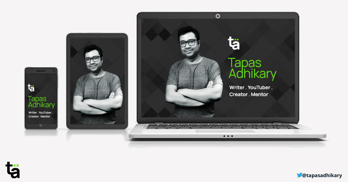
I have made a kickass automated portfolio site with Next.js. Here is how.
A portfolio site is the modern form of resume to help with jobs, contacts, and growth. Know how I built an automated portfolio site with a balanced UX
Developers are powerful creators. When your knowledge, creativity, and passion come together, you create something you are most proud of. I have a similar feeling today!
Did I tell you, I have redone my portfolio site from scratch? But why was it so important? Right, that's what is this article is about. I hope you find it helpful.
TL;DR
- The Updated NEW Site
- OLD Portfolio Site
- I have used Next.js, Tailwindcss to build it, and I'm in total love with them.
- The
newsite is (mostly)automatedwith Next.js API Routes and SWR. - The site is
deployedon Vercel. - In this article, I'm going to take you through my
process and journey, a very little about thecodeitself. The code part is coming in the future posts.
What is a Portfolio website, and why do you need it?
A portfolio website provides your professional information to your potential clients, job hires, consumers. It is the place to showcase your work, let the world know who you are and what you are up to.
When a potential client, HR, hiring manager visits your portfolio site, they should get a feel of your strengths and what you are capable of. In the modern era, a good portfolio website may replace the olden day's resumes of job seekers. Building a portfolio and keeping it updated helps in this case. It also helps us to reconnect with what we have done in the past from a single place.
My Journey in 5 Points
I already had a portfolio site. It worked great but with a few limitations,
- I had to update the content manually.
- It was not showing my capabilities enough.
- The design was not so open to accommodate a new addition easily.
- There was always an urge to do better with UX.
- It was missing a brand.
So, one evening when I sat with the pencil and paper, I could identify five key points to drive changes keeping my motivations high. Let's see them.
1. The Focus is on YOU
The primary focus of your website should be on YOU. It means you need to project your face, attitude, work, passion, aspirations, all that someone will find interesting.
In my case, the list includes,
- An apparent
profile photoshowing my face and attitude. - As a blogger, mention my
blog. - People should know about my
Youtubechannel. - A list of
side hustles(projects)I have done. - My
sponsors, supporters, and the reasons. - A
newslettersubscription. - To communicate about my
career growthin numbers. - To tell more
about me, with a personal connection.
The below image is the mind map of my work with myself at the center.

The next thing is about creating a personal brand. It is about identifying,
- Who are you?
- What do you want to be known for?
- How do you put your best strength into practice to create an impression, build public connections, and network.
- Above all, how do you promote yourself using your work.
2. The Content is the KING
After you identify the areas to focus on, you need to think about the content and how best you can organize them.
Again, in my case, the content includes,
- Articles from my Hashnode powered blog.
- Post information from other publications I write for like, freeCodeCamp, Dev, CSS-Tricks.
- Show the video information from the Youtube Channel.
- Show the side project information from my GitHub repositories.
- Show the NPM packages published by me.
- Show the information about my sponsors and supporters.
- Integrate with a newsletter service like Revue.
- Show some exciting data from Twitter.
- Many more.
The image below shows the mind map of items that I can accommodate immediately(the green lines), and some are for the future(yellow dotted lines).

The next thing is about organizing the content. Let's discuss that in the next point where we talk about User Experience(UX).
3. The UX is the QUEEN
If the content is a
king, the user experience(UX) is thequeen. They must work together to rule.
Here are a few factors that need primary attention,
Organization of content: How better you can organize the content so that users do not seek much to get to it. At the same time, they shouldn't get overwhelmed by the quantity of it.I tried balancing it by providing a list of my recent articles, videos on the home page with the links to get more. I have provided searches, lazyload of content on scroll to limit the content overwhelming to users.

Colors, Fonts, and Themes: I'm probably simplifying it here, but these are strong foundations of a great UX. I have made extensive research before settling down with a color palette, font choice, and dark theme as a default theme.Color Palette: Select the primary brand color in various shades. For my site, the color palette looks like this,

Font - When you build a content-oriented website, it will have many things to read. So you need to select a font that looks clean and easy to eyes. For my website, I am using the Manrope font, an open-source modern sans-serif font designed by Mikhail Sharanda in 2018-2019.
Themes - Dark & light themes are the default choices for the theme design.

Responsiveness: A majority of the device usages goes to mobile and other hand-held devices. It is a mandatory requirement for you to support responsiveness. It will be unfortunate if a recruiter tries to see your profile on mobile and find it nonresponsive.
Animations: Animations are like salt in your food. When you use it right, the food tastes perfect. Over or undergoing it may leave the users with unpleasant experiences. Introducing a subtle introductory animation may set the right mood for your users.
To me,
UX is all about keeping the balance!
4. Make a Right Choice of TECHNOLOGY STACK
When I started the initial design, I had plenty of choices in front of me. Today web technologies provide(confuse) you with many options. I have been exploring Next.js and tailwindcss for a while now.
- Next.js: Next.js is the future(arguably?) for React-based projects. It is easy to set up, learn, and use. The API routes help to create endpoints quickly and efficiently.
- Vercel: It is super easy to deploy and maintain your Next.js app(including serverless functions) using Vercel.
- Tailwindcss: It is a developer-friendly CSS library.
I have a strong feeling that this technology stack(nextjs-vercel-tailwindcss) is going to stay for a long due to its wide adoption, community support, the ease of use.
5. Update Frequently but AUTOMATICALLY
Any website is NOT a one-time affair. It requires updates and changes to keep it relevant. Usually, you may want to make two types of updates: the look-and-feel update and the content update.
The look-and-feel update doesn't take place very often, and you can plan it. However, if you are a frequent content creator, you may have to update the website frequently. It could be tiring for someone to do it manually. Here you should explore the opportunities to automate the content as much as possible.
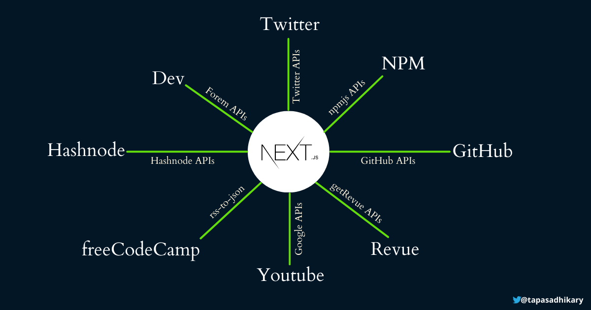
Here is the mind map of the content sources for my portfolio site,

As you see, Next.js can communicate to the APIs of each of the services to fetch/create data. It is an excellent approach as you do not have the burden of maintaining it manually.
Here is the list of free API services I'm using. I hope you find it helpful.
- Hashnode: Do you have a blog on the Hashnode platform? Hahsnode has the public APIs to interact with your blog data. Please use this playground to try it out.
- Dev: Please find the DEV APIs from here. These are beta at the time of writing this post.
- Twitter: If you have a Twitter account, you can apply for API access to fetch data. Here is the link to do that.
- NPM: You have plenty of options here to get information about an NPM. Please checkout npm-api library.
- GitHub: GitHub provides you many API endpoints to access data relevant to you.
- Revue: Twitter Revue newsletter service has the APIs to interact with subscribers, issues, and other information. Check it out from here.
- Youtube: You can access the Youtube data like videos, subscribers, views, likes, and many more using the API services.
- freeCodeCamp: If you are an author to freeCodeCamp, you can request a read-only API access key to the team by mailing them. An alternate way is to use your article's RSS feed as input to rss-to-json NPM to create dynamic JSON data for the project.
So, how is the Feedback so far?
The feedback is genuinely motivating so far. Thanks to tech Twitter for pouring in lots of feedback to let me know I'm on the right track. It also helped to figure out a bunch of bugs to fix. The thread below captures some great discussions about it,
If you have any feedback, please feel free to let me know.
What's next?
An excellent outcome of building something is, you get plenty to share. I'll share much technical knowledge I have gained by building the portfolio website in the coming days. Expect them on your way as articles, videos, and threads. That's all for now. Please like/share this post if you find it helpful.
Let's connect. You can follow me on Twitter(@tapasadhikary), LinkedIn(tapasadhikary), and GitHub(atapas).