Effective Ways to Manage Shadcn Dialog Box: 3 Tips with Code
How to Seamlessly Combine shadcn/ui Dialogs with your UI components like forms for Optimal Use, let's learn with a project and code examples.
Recently I encountered a couple of challenging use cases with the shadcn/ui dialog box with forms as its content. As I learned to tackle them, here is what I learned to share with you, hoping that it helps you as well.
First, the shadcn dialog box component is not broken(contrary to a few articles and videos about it on the internet). It provides you with all the required primitives to build everything you want with the dialog box. However, I agree that you have to take a few extra steps to meet some use cases with satisfaction.
In this article, we will discuss three such use cases that you may encounter often with the shadcn dialog box.
Use cases to implement
Here are three use cases we will be focusing on:
The shadcn dialog box has a trigger where you can specify a UI element like a button or an anchor that the user can click to open the dialog. This is great, but in many situations, you may want this trigger point to exist outside of the dialog box. You may want to have a separate component with a button that opens the dialog when clicked.
When the dialog trigger is outside of the shadcn dialog box, the closing behaviour of the dialog box using the escape key and the cross icon at the header changes. It doesn’t work as is. How do we fix that?
Sometimes you want to use a form as the content of the shadcn dialog box. In this situation, the submit button to the form submission will be part of the form, not the dialog box. How would you handle closing the dialog box after you submit the form?
Before we start looking into the code, let me inform you that, these tips are also explained here as a video tutorial, you can take a look:
Setting up a shadcn project with Next.js App router
We will be creating a project using the shadcn/ui with the Next.js App router. I assume that you got an introduction to Next.js and shadcn already. But if you are new to them, do not worry. Check this out as a prerequisite and then come back to this article to follow along. Also, be assured that you will be able to use the same code in your ReactJS applications as well.
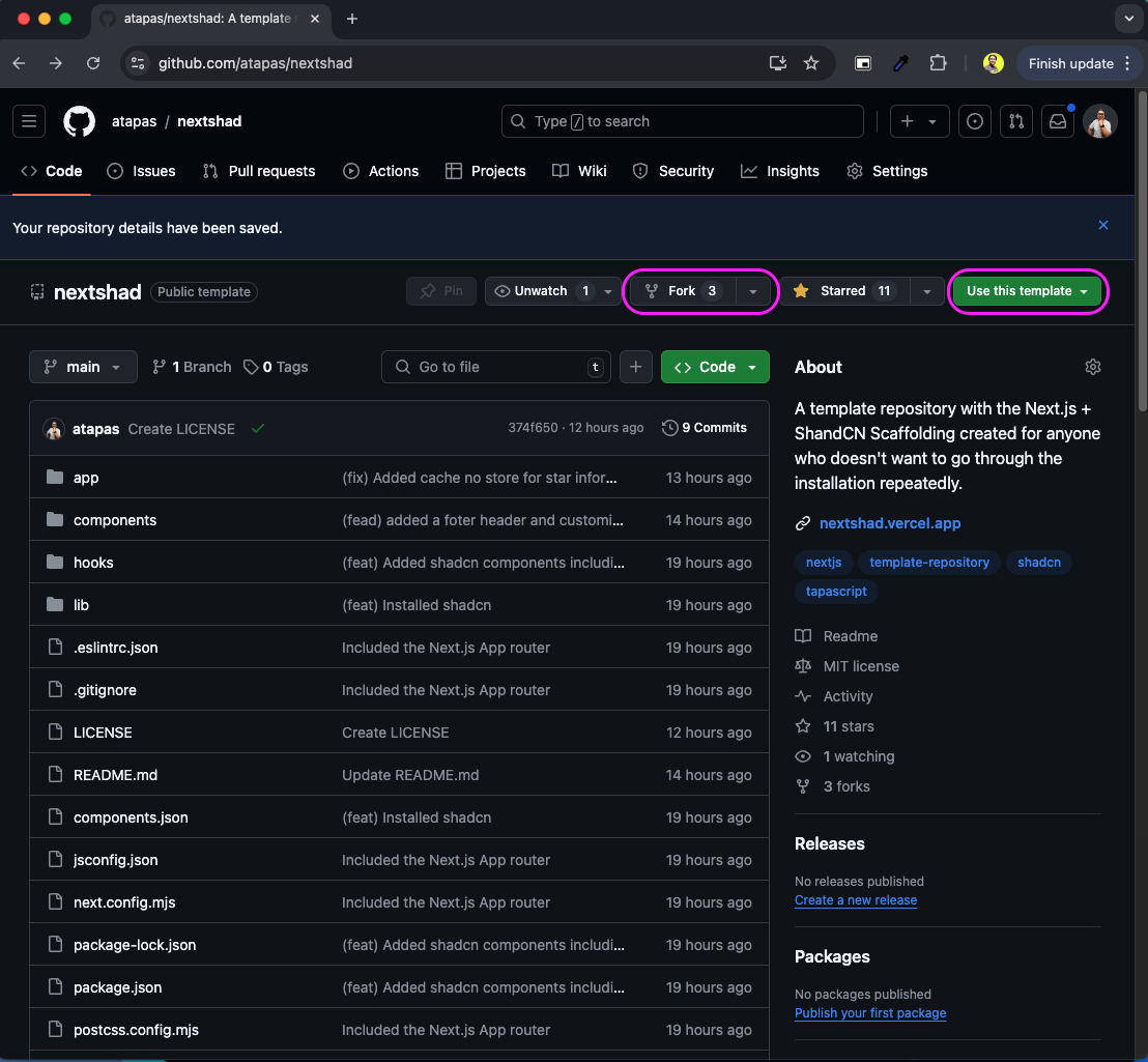
If you have a Next.js project configured with the shadcn, great! Please use that. Alternatively, head over to this repository and fork the repo or use the repo as a template as suggested in the image below.
The
nextshadis a template repository that helps you to get started with your Next.js and ShadCN projects with one click! It is a Next.js + ShandCN Scaffolding created for anyone who doesn't want to go through the installation repeatedly.
Next, browse to the project repository folder and install the dependencies using the following command:
npm install
# or
yarn install
# or
pnpm install
# or
bun install
Now, you can start the application locally using this command:
npm run dev
# or
yarn dev
# or
pnpm dev
# or
bun dev
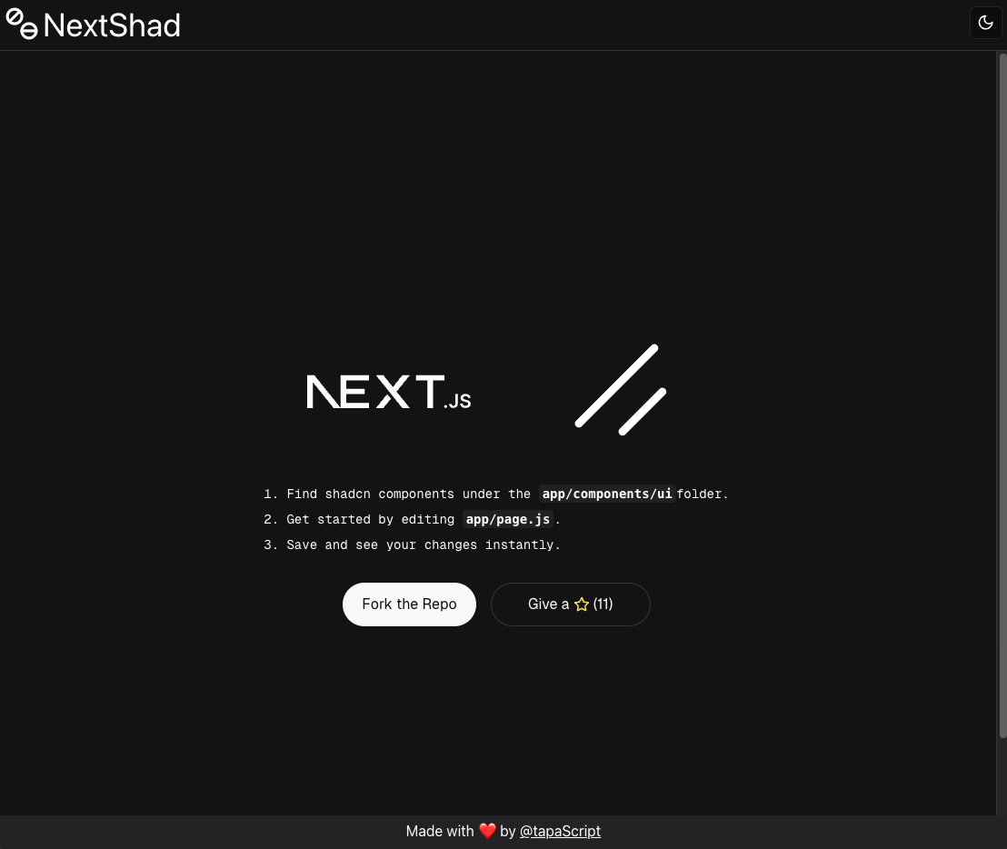
Open http://localhost:3000/ with your browser to see the application. You should see a screen like this:
Now open the project in your favourite code editor(it is still VS Code for me!) and get ready to add more code to the project source code.
Handling the dialog box trigger from outside
Let us create a dialog box following the shadcn documentation. Create a folder called dialogs under the components folder. Now create a file called register-dialog.jsx under the components/dialogs folder with the following code snippet:
// File: /components/dialogs/register-dialog.jsx

import { Button } from "@/components/ui/button"
import {
  Dialog,
  DialogContent,
  DialogDescription,
  DialogFooter,
  DialogHeader,
  DialogTitle,
  DialogTrigger,
} from "@/components/ui/dialog"
import { Input } from "@/components/ui/input"
import { Label } from "@/components/ui/label"

export function RegisterDialog() {
  return (
    <Dialog>
      <DialogTrigger asChild>
        <Button variant="outline">Register</Button>
      </DialogTrigger>
      <DialogContent className="sm:max-w-[425px]">
        <DialogHeader>
          <DialogTitle>Register to tapaScript</DialogTitle>
          <DialogDescription>
            Register to tapaScript to get all the content FREE forever!
          </DialogDescription>
        </DialogHeader>
        <div className="grid gap-4 py-4">
          <div className="grid grid-cols-4 items-center gap-4">
            <Label htmlFor="name" className="text-right">
              Name
            </Label>
            <Input
              id="name"
              className="col-span-3"
            />
          </div>
          <div className="grid grid-cols-4 items-center gap-4">
            <Label htmlFor="username" className="text-right">
              Email
            </Label>
            <Input
              type="email"
              id="email"
              className="col-span-3"
            />
          </div>
        </div>
        <DialogFooter>
          <Button type="submit">Save changes</Button>
        </DialogFooter>
      </DialogContent>
    </Dialog>
  )
}
Here, we have created a simple dialog box with two fields, name and email. Please note, that the dialog has a trigger where we have defined a button, clicking on which the dialog will be shown. It means the trigger to open the dialog is now within the dialog component itself.
Let us now create another component where we can use this dialog box. Create a file called register.jsx under the components/ folder with the following code snippet:
// File: /components/register.jsx

"use client";

import { RegisterDialog } from "./dialogs/register-dialog";

const Register = () => {
    return <RegisterDialog />;
};

export default Register;
As you notice, it is a simple component that imports the dialog component and uses it.
Finally, let us use the Register component into the home page:
// File: /app/page.jsx

import Register from "@/components/register";

export default async function Home() {
    return (
        <div className="flex justify-around m-4">
            <Register />
        </div>
    );
}
Now, you should see a Register button when you go to the home page using the URL http://localhost:3000.

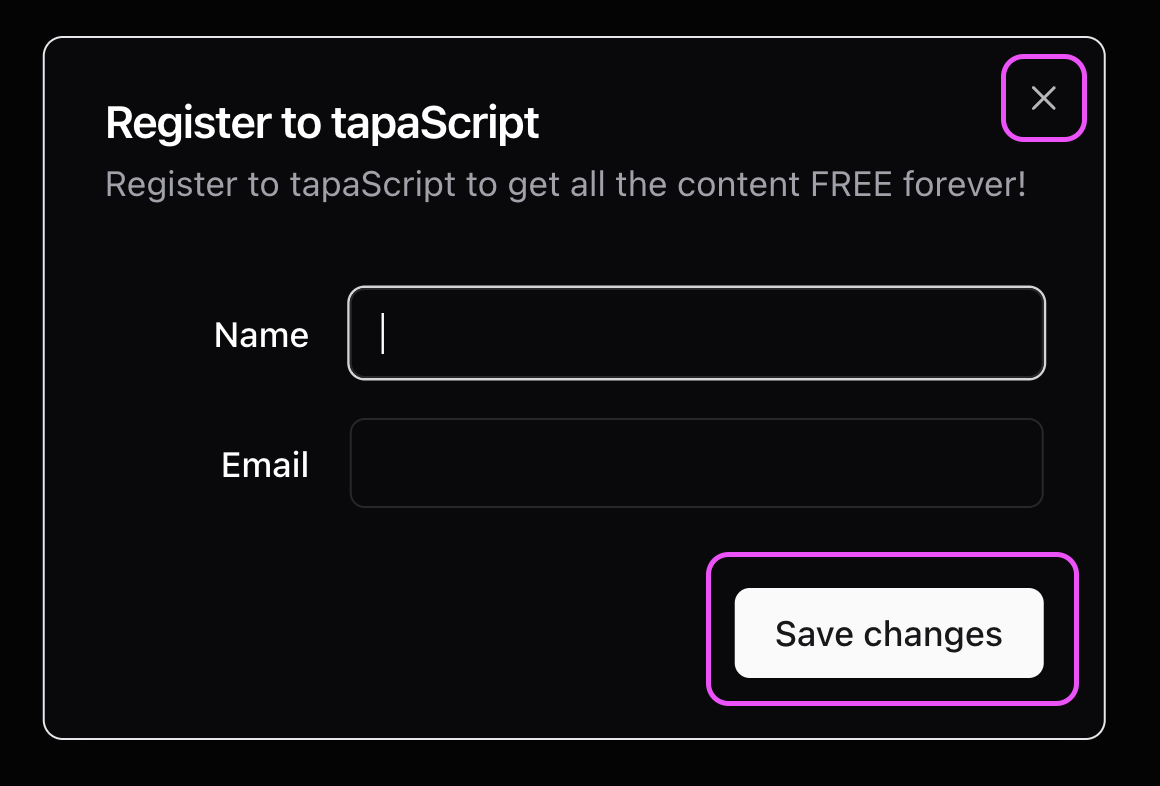
Clicking on the Register button opens up the dialog. We can also close the dialog by clicking on the cross icon at the top-right, the Save changes button at the bottom, or just by hitting the escape(esc) key.
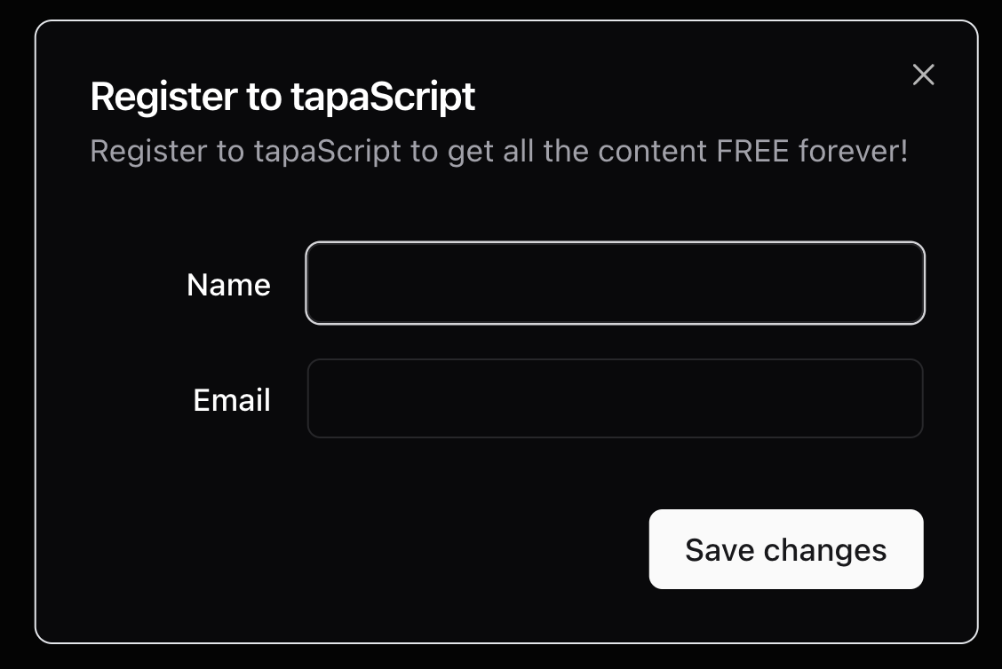
This is great! But the problem is that the trigger to open the dialog is in the dialog itself. In many situations, you may want the trigger to be outside of the dialog, may be inside some other components. So, let us handle that situation.
To handle it, we will need a state to maintain the open and closed state of the dialog box. Open the register.jsx file and import a Button component from the shadcn, and the useState hook from ReactJS.
Then create a state called open and initialize it with false. Add a register button to the JSX. Add an onclick handler to the button to set the open state value to true. So now, every time the button is clicked the open state will have the value true assigned to it.
Next, we will pass the open state value as a prop to the RegisterDialog so that we can control the dialog’s visibility with it.
Here are the code changes to accommodate all these.
// File: /components/register.jsx

"use client";

import { Button } from "./ui/button";
import { useState } from "react";
import { RegisterDialog } from "./dialogs/register-dialog";

const Register = () => {
    let [open, setOpen] = useState(false);
    return (
        <>
            <Button onClick={() => setOpen(true)}>Register</Button>
            <RegisterDialog open={open} />
        </>
    );
};

export default Register;
Now, in the register-dialog.jsx file, let’s pass the open prop to the RegisterDialog component. The Dialog component has a prop called open that controls the visibility of the dialog box. If it is set to true the dialog box will be shown, and will be hidden otherwise.
Hence, we pass the open prop value of the RegisterDialog to the Dialog component’s open prop. Also, note that we have removed the trigger from the dialog box.
Here is the changed code:
// File: /components/dialogs/register-dialog.jsx

// --- Code as is here ---
export function RegisterDialog({open}) {
  return (
    <Dialog open={open}>
      <DialogContent className="sm:max-w-[425px]">
        <DialogHeader>
          <DialogTitle>Register to tapaScript</DialogTitle>
          <DialogDescription>
            Register to tapaScript to get all the content FREE forever!
          </DialogDescription>
        </DialogHeader>
        <div className="grid gap-4 py-4">
          <div className="grid grid-cols-4 items-center gap-4">
            <Label htmlFor="name" className="text-right">
              Name
            </Label>
            <Input
              id="name"
              className="col-span-3"
            />
          </div>
          <div className="grid grid-cols-4 items-center gap-4">
            <Label htmlFor="username" className="text-right">
              Email
            </Label>
            <Input
              type="email"
              id="email"
              className="col-span-3"
            />
          </div>
        </div>
        <DialogFooter>
          <Button type="submit">Save changes</Button>
        </DialogFooter>
      </DialogContent>
    </Dialog>
  )
}
So now, the flow is like this:
The Register button gets clicked.
It sets the
openstate totrue.The same has been passed as a prop to the
Dialogcomponent.Hence the dialog will be shown on the button click.
This is great! We have now detached the trigger from the dialog component and handled it from the outside. However, we still have a couple of things broken that we need to fix:
The dialog doesn’t get closed when you click on the cross icon.
It doesn’t get closed on pressing the escape key.
It doesn’t get closed by clicking the
Save changesbutton as well.
Let’s fix these.
Handling the closing of the dialog box
Whenever we hit the cross icon or the escape key to close the dialog box, a callback function called onOpenChange gets called which turns the value of the open state from true to false.
So, as we have our own open state which we have stitched with the dialog’s open state already, if we can turn it to false when the cross icon or the escape was hit, we are done!
Let us now pass one more prop to the RegisterDialog to set the value of the open state in the Register component.
<RegisterDialog open={open} setOpen={setOpen} />
Here is the changed code:
// File: /components/register.jsx

"use client";

import { Button } from "./ui/button";
import { useState } from "react";
import { RegisterDialog } from "./dialogs/register-dialog";

const Register = () => {
    let [open, setOpen] = useState(false);
    return (
        <>
            <Button onClick={() => setOpen(true)}>Register</Button>
            <RegisterDialog open={open} setOpen={setOpen} />
        </>
    );
};

export default Register;
So next, take the setOpen prop and use it as the value of the onOpenChange prop of the Dialog component. This will ensure that every time the cross icon is clicked or the user hits the escape key, the setOpen() will set the open state to false and the dialog box will be dismissed.
About the Save changes button, we can add an onClick handler and set the open state value to false explicitly.
All the code changes are mentioned below:
// File: /components/dialogs/register-dialog.jsx

// --- Code as is here ---

export function RegisterDialog({open, setOpen}) {

  const handleCloseDialog = (event) => {
    event.preventDefault();
    setOpen(false);
  }

  return (
    <Dialog open={open} onOpenChange={setOpen}>
      <DialogContent className="sm:max-w-[425px]">
        {/* REST OF THE CODE AS IS HERE */}
        <DialogFooter>
          <Button
             type="submit"
             onClick={handleCloseDialog}>
                Save changes
          </Button>
        </DialogFooter>
      </DialogContent>
    </Dialog>
  )
}
That’s it. Now, we can open the dialog from an external trigger and also can close it seamlessly. However, in most cases, you may not code the form fields and the submit button within the dialog itself.
For better re-usability and maintainability, you may want to have a separate component for the registration form with a submit button, and then you want to use the registration form component in the dialog.
Here you may face the issue of closing the dialog when the form gets submitted from another component. Let us see that and fix it as well.
How to close a shadcn dialog box on form submission?
Let us create a form called registration-form.jsx under the components/form/ folder with the following code:
// File: /components/forms/registration-form.jsx

import { zodResolver } from "@hookform/resolvers/zod";
import { useForm } from "react-hook-form";
import { z } from "zod";

import { Button } from "@/components/ui/button";
import { Input } from "@/components/ui/input";

import {
    Form,
    FormControl,
    FormDescription,
    FormField,
    FormItem,
    FormLabel,
    FormMessage,
} from "@/components/ui/form";

const formSchema = z.object({
    email: z
        .string()
        .min(1, {
            message: "You mus give an email address.",
        })
        .email("This is not a valid email."),
});

export function RegistrationForm() {
    const form = useForm({
        resolver: zodResolver(formSchema),
        defaultValues: {
            email: "",
        },
    });

    async function onSubmit(values) {
        console.log(values);
    }

    return (
        <Form {...form}>
            <form
                onSubmit={form.handleSubmit(onSubmit)}
                className="space-y-8">
                <FormField
                    control={form.control}
                    name="email"
                    render={({ field }) => (
                        <FormItem>
                            <FormLabel>Your Email</FormLabel>
                            <FormControl>
                                <Input
                                    type="email"
                                    placeholder="Specify an Email"
                                    {...field}
                                />
                            </FormControl>
                            <FormDescription>
                                Give a Valid Email Address
                            </FormDescription>
                            <FormMessage />
                        </FormItem>
                    )}
                />
                <Button type="submit">Submit</Button>
            </form>
        </Form>
    );
}
We have used the form component from shadcn which uses the react-hook-form underneath. The form has just one input element email and a submit button. We have the onSubmit() method to capture the form data values when the form is submitted.
Now it is time to include the form inside the dialog. Please import the RegistrationForm in the dialog and use it inside the DialogContent. Note that, we have removed the submit button from the dialog.
// File: /components/dialogs/register-dialog.jsx

// --- Code as is here ---

import { RegistrationForm } from "../forms/registration-form"

export function RegisterDialog({open, setOpen}) {

  const handleCloseDialog = (event) => {
    event.preventDefault();
    setOpen(false);
  }

  return (
    <Dialog open={open} onOpenChange={setOpen}>
      <DialogContent className="sm:max-w-[425px]">
        <DialogHeader>
          <DialogTitle>Register to tapaScript</DialogTitle>
          <DialogDescription>
            Register to tapaScript to get all the content FREE forever!
          </DialogDescription>
        </DialogHeader>
        <RegistrationForm/>
      </DialogContent>
    </Dialog>
  )
}
Now, if you click on the Register button, you will have the dialog with a form like this:
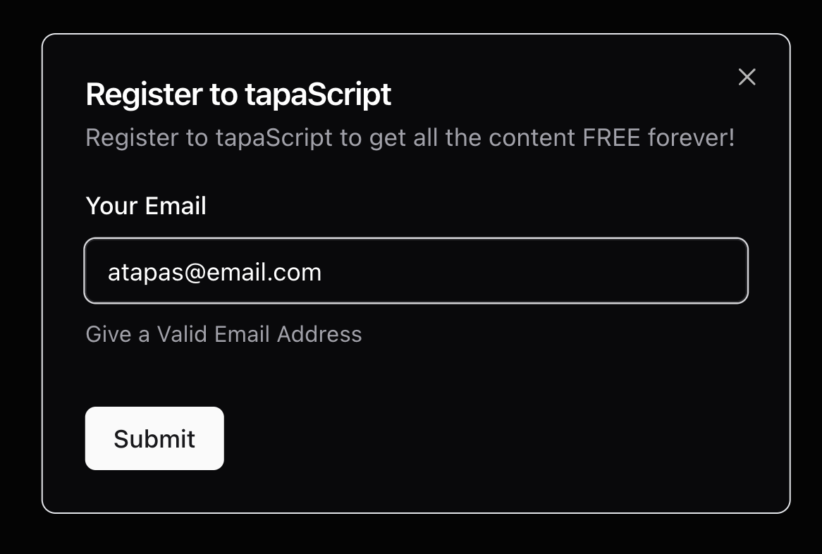
So far so good. However, if you fill up the form with a valid email and submit it, the dialog will not close. Now we need to use the open state with its setOpen updater function to close the dialog box.
In the register-dialog.jsx, we already have the handleCloseDialog() function which sets the open state value to false.
// File: /components/dialogs/register-dialog.jsx

const handleCloseDialog = (event) => {
    setOpen(false);
}
Pass it as a value to the prop onSave of the RegistrationForm.
// File: /components/dialogs/register-dialog.jsx

<RegistrationForm onSave={handleCloseDialog}/>
Now, open the RegistrationForm and pass the onSave prop to the component. Use the same inside the onSubmit() function as shown below.
// File: /components/forms/registration-form.jsx

// --- Code as is here ---
export function RegistrationForm({onSave}) {
    // --- Code as is here ---

    async function onSubmit(values) {
        console.log(values);
        onSave();
    }

    return (
       {/* --- Code as is here ---  */}
    );
}
Here, now the flow is:
The user fills up the form and hits the submit button.
If the input is valid, the
onSubmit()method will be called.Inside onSubmit, we are calling the
onSave()function which is passed as prop.The
onSave()function ultimately sets theopenstate of the dialog box tofalseresulting in the dialog closing.
Wow… we are done.
What’s Next?
I hope you enjoyed learning and coding along with me so far. If you want to look into the source code used in this article, here is the GitHub repository for you!
https://github.com/tapascript/next-shadcn-problems/tree/dialog-close-form-submission
This repository also extends the code to add the registered users to the browser’s localstorage and show them on the page as they get saved. You may enjoy going through that code as well. Please explore.
Liked it? Please let me know with your comments and likes. ❤️
Let's connect. I share knowledge on web development, content creation, Open Source, and careers on these platforms.