The story behind Web Animations API(WAAPI) and Happy Diwali 2020
HTML element animations using CSS properties is very exciting. The CSS animation property helps to animate the CSS properties like height, width, color, font, background-color, and many more. In case you were unaware, we also have a native API called .animate() helps in doing animation using JavaScript.
In this article, we will see the usages of the JavaScript Web Animations API(also known as WAAPI) and learn it with examples. It is Diwali time, the Indian festival of lights. Hence a better excuse to create some brighter animations using WAAPI.
But first, What are animation properties?
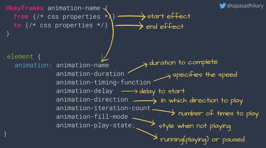
There are key animation properties we need to be aware of to be more creative with an animation outcome. The image below explains the properties required to animate an element using CSS. WAAPI uses the same properties under the hood but from JavaScript.

If you are new to @keyframes,
A
keyframein animation and filmmaking is a drawing that defines the starting and ending points of any smooth transition.
The @keyframes rule specifies the start and end of the animation with two properties, "from" and "to". You can also specify the actions with percentages such as 0%(the from property), 25%, 50%, 75%, 100%(the to property), etc.
Happy Diwali animations with CSS
With the understanding, we got so far, let us create a few animations to wish a Happy Diwali 2020 to our readers! It looks (and feels) like this,
We have a glowing banner message that says, 'Happy Diwali 2020' and four fire-lamps. As there are winds around(we don't see it!), we see a smooth movement in the fire of each of the lamps.
The Fire-Lamp Animation
The individual fire-lamps are created with this HTML structure,
<div>
  <div class="fire"></div>
  <div class="base"></div>
</div>
As we animate only the fire(like a swing), we first need to create an animation rule using @keyframes. Then we need to define the animation properties for the fire(div that has the class name, 'fire'). In this case, our animation rule is to rotate the element 30 degrees on either side.
@keyframes swing{
    0% {transform:rotate(30deg);}
    50% {transform:rotate(-30deg);}
    100% {transform:rotate(30deg);}
}

.fire{
    animation: swing 2s infinite ease-in-out;

    ... all other CSS properties
}
The Banner Message Animation
The banner message is a plain H1 tag like,
<h1 class="glow">Happy Diwali 2020</h1>
So, in this case, our animation rule is to simply give a glow effect to the banner message with text shadowing(something the same as this). The text-shadow CSS property adds a shadow to text. We first define an animation effect using the @keyframes rule. It applies multiple text shadows by changing the colors. We then apply the same rule to the banner element.
@keyframes glow{
  0% { text-shadow: 0 0 10px #fff, 0 0 20px #fff, 0 0 30px #EAB72F, 0 0 40px #e60073, 0 0 50px #e60073, 0 0 60px #EAB72F, 0 0 70px #EA5C2F}

  25% { text-shadow: 0 0 10px #fff, 0 0 20px #fff, 0 0 30px #36EA2F, 0 0 40px #36EA2F, 0 0 50px #36EA2F, 0 0 60px #36EA2F, 0 0 70px #36EA2F}

  50% { textShadow: 0 0 10px #fff, 0 0 20px #fff, 0 0 30px #e60073, 0 0 40px #e60073, 0 0 50px #362FEA, 0 0 60px #e60073, 0 0 70px #362FEA}

  100% { textShadow: 0 0 10px #fff, 0 0 20px #ff4da6, 0 0 30px #362FEA, 0 0 40px #EA5C2F, 0 0 50px #EAB72F, 0 0 60px #ff4da6, 0 0 70px #ff4da6}
}

.glow {
    animation: glow 1s infinite ease-in-out alternate;

    ... all other CSS properties
}
In the next section, we will redo the same animation using the Web Animations API and learn some great things about it.
With Web Animations API
The Web Animations API lets us construct animations and control their playback with JavaScript. This is a great power given to JavaScript developers to separate the presentation from the behavior of an element.
Representing keyframes
The first thing we need to do is to create an object that represents the CSS @keyframes rule. We define with an array of required transitions.
let swing = [
    { transform: 'rotate(30deg)' },
    { transform: 'rotate(-30deg)'},
    { transform: 'rotate(30deg)' }
 ]
Create an animation object
Next thing is to use this array in the animate() API to start the animation.
let element = document.getElementById('light-1');
const animateX = element.animate(
  swing,
 {
    duration: 2000,
    iterations: Infinity,
    easing: 'ease-in-out'
 }
);
Animation object and methods
As we get an animation object(amimateX) we can use it to call methods like,pause(), play(), reverse(), and updatePlaybackRate(), etc.
Element.animate()method will immediately run after it is called.Animation.pause()will pause the animation.Animation.play()will play the animation from the point it was paused.Animation.finish()skips to the end of the animation.Animation.cancel()aborts the animation and removes its effects.Animation.reverse()sets the animation’s playback rate (Animation.playbackRate) to a negative value so it runs backward.Animation.playbackRateproperty of the Web Animations API returns or sets the playback rate of the animation. It takes a number that can be 0, negative, or positive.Animation.updatePlaybackRate()helps updating the playbackRate value.Document.getAnimations()returns an array of all Animation objects.
Now think about the possibilities we have. We can control lots about the animation behavior from the JavaScript code. Here is an example where we are using the pause() and play() methods to pause and play the Happy Diwali animations.
To pause,
const pause = () => {
  animateX.pause();
  animateY.pause();
  glow.pause();
}
To play,
const play = () => {
  animateX.play();
  animateY.play();
  glow.play();
}
We can also set the animation property value of one element depending on the animation property value of another.
let element = document.getElementById('light-1');
const animateX = element.animate(
  swing,
 {
    duration: animateY.effect.getComputedTiming().duration / 2,
    iterations: Infinity,
    easing: 'ease-in-out'
 }
);
Here we are setting the duration of animateX depending on the duration value of another animation object, animateY.
Callbacks and Promises
CSS animations and transitions have their own event listeners and we have those available using the Web Animations API as well.
onfinishis the event handler for the finish event. It can be triggered withfinish().oncancelis the event handler for the cancel event. It can be triggered withcancel().
Browser Support
The basic Web Animations API features discussed here are available by default in Firefox 47+, Chrome 36+, and Safari 13.7+. There is also a polyfill that tests for feature support and adds it where necessary. Here is the link from caniuse.com to know more.
CSS animations vs WAAPI
CSS animations and WAAPI shouldn't be looked at as competitors. We can write animations in CSS and can interact with it using the WAAPI methods. Using them together will give lots of flexibility to the Web Developers.
Resources
I've found a few resources which are excellent to use as references.
- MDN guide of how to use Web Animations API
- An awesome series by Dan Wilson on Let’s talk about the Web Animations API
- A bunch of demos on WAAPI
If you are new to CSS animations, you may find this article useful,
Before we end...
Thank you for reading this far! Let's connect. You can @ me on Twitter (@tapasadhikary) with comments, or feel free to follow.
If it was useful to you, please Like/Share so that, it reaches others as well. Please hit the Subscribe button at the top of the page to get an email notification on my latest posts.
That's all for now. See you again with my next article soon. Until then, please take good care of yourself and have a safe Diwali.